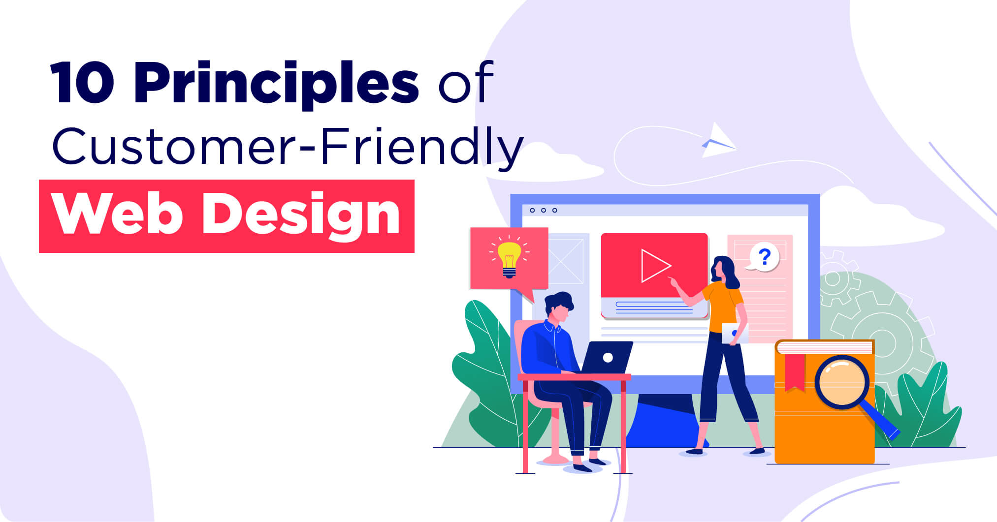
Welcome to the digital era, where a well-designed website can make or break your online presence. With millions of websites vying for attention, it’s crucial to ensure that yours not only stands out visually but also delivers an exceptional user experience. Whether you’re a business owner looking to revamp your existing site or an aspiring web designer in Kolkata seeking insights into customer-friendly design principles, you’ve come to the right place.
In this blog post, we’ll delve into 10 essential principles for website design in kolkata that will help you create a website that captivates your target audience and drives results. From typography and color palettes to responsive design and search engine optimization (SEO), we’ll cover it all! Let’s get started! Grab a cup of coffee and let’s get started!
The Purpose of Your Website
Why does your website exist? What is its purpose? These are questions you need to answer before diving into the design process. Your website should align with your overall business goals and objectives. Would you like to sell products or services online? Perhaps you want to provide valuable information and resources to your audience. Understanding the purpose of your website will guide every decision you make in terms of design, content, and functionality.
A well-defined purpose allows you to create a clear structure for your site. It helps you determine what pages and sections are necessary for achieving your goals. For example, an e-commerce site would require product pages, a shopping cart, and secure payment options.
Remember that the purpose of your website should also consider the needs and expectations of your target audience. Put yourself in their shoes – what are they looking for when they visit a site like yours? By understanding their motivations and desires, you can tailor both the aesthetics and functionality of your website to meet their needs effectively.
Design for Your Target Audience
Designing a website is not just about making it visually appealing; it’s also about creating an experience that resonates with your target audience. Understanding your audience and their needs is crucial in designing a customer-friendly website.
Identify your target audience by conducting thorough research. Who are they? What are their preferences, interests, and pain points? Gathering this information will help you tailor the design elements to cater to their specific needs.
Once you have a clear understanding of your target audience, focus on creating a user-centered design. Keep in mind that different demographics may have varying expectations when it comes to usability and aesthetics. For example, if you’re targeting younger audiences, consider incorporating trendy visuals and interactive features. On the other hand, if your target audience consists of older individuals, prioritize ease of navigation and clear fonts.
Another important aspect is ensuring accessibility for all users. Designing for inclusivity means considering factors such as color contrast for visually impaired users or providing alternative text for images for those who rely on screen readers.
Use typography to create hierarchy and contrast
Typography is an essential element in web design that often gets overlooked. However, it can have a significant impact on the overall user experience of your website. When used effectively, typography can create hierarchy and contrast, making it easier for users to navigate and understand your content.
One way to achieve this is by using different font sizes and weights to distinguish between headings, subheadings, and body text. By increasing the size or weight of important headings, you can draw attention to them and make them stand out from the rest of the content.
Contrast is also crucial when it comes to typography. Using contrasting fonts or colors can help differentiate between different sections or elements on your website. For example, pairing a bold sans-serif font with a delicate script font can create an eye-catching contrast that guides users’ eyes through the page.
In addition to size and weight variations, spacing plays a vital role in creating hierarchy within typography. Adding sufficient white space around headings or paragraphs helps break up the content and makes it easier for users to scan through information quickly.

Stick to a limited color palette
When it comes to creating a customer-friendly website, one important principle to keep in mind is sticking to a limited color palette. While it can be tempting to go all out with vibrant colors and bold contrasts, using too many colors can overwhelm your visitors and make your website look cluttered.
Instead, opt for a limited color palette that aligns with your brand identity and resonates with your target audience. Choose two or three main colors that complement each other well and use them consistently throughout your website. This will help create a cohesive and visually pleasing experience for your users.
Using a limited color palette also helps draw attention to specific elements on your website. By strategically incorporating pops of color in buttons, headlines, or call-to-action sections, you can guide users’ focus towards important information or actions you want them to take.
Use whitespace to create visual interest and draw attention to specific elements
Whitespace, also known as negative space, is a powerful design element that can greatly enhance the visual appeal and usability of your website. It refers to the empty spaces between elements on a page, such as margins, padding, and gaps between lines or paragraphs.
Using whitespace effectively can create a sense of balance and harmony in your web design. By giving elements room to breathe, you can draw attention to specific areas or content on your site. Whitespace not only makes it easier for users to navigate through your site but also helps them focus on what’s important.
One way to use whitespace strategically is by increasing the spacing around important elements like headings or buttons. This creates contrast and makes those elements stand out more prominently on the page. Conversely, reducing the spacing around less important items can de-emphasize them and prevent clutter.
Another technique is using larger amounts of whitespace between sections or blocks of content. This separation enhances readability and allows users to digest information more easily. It also gives your website an overall cleaner and more organized appearance.
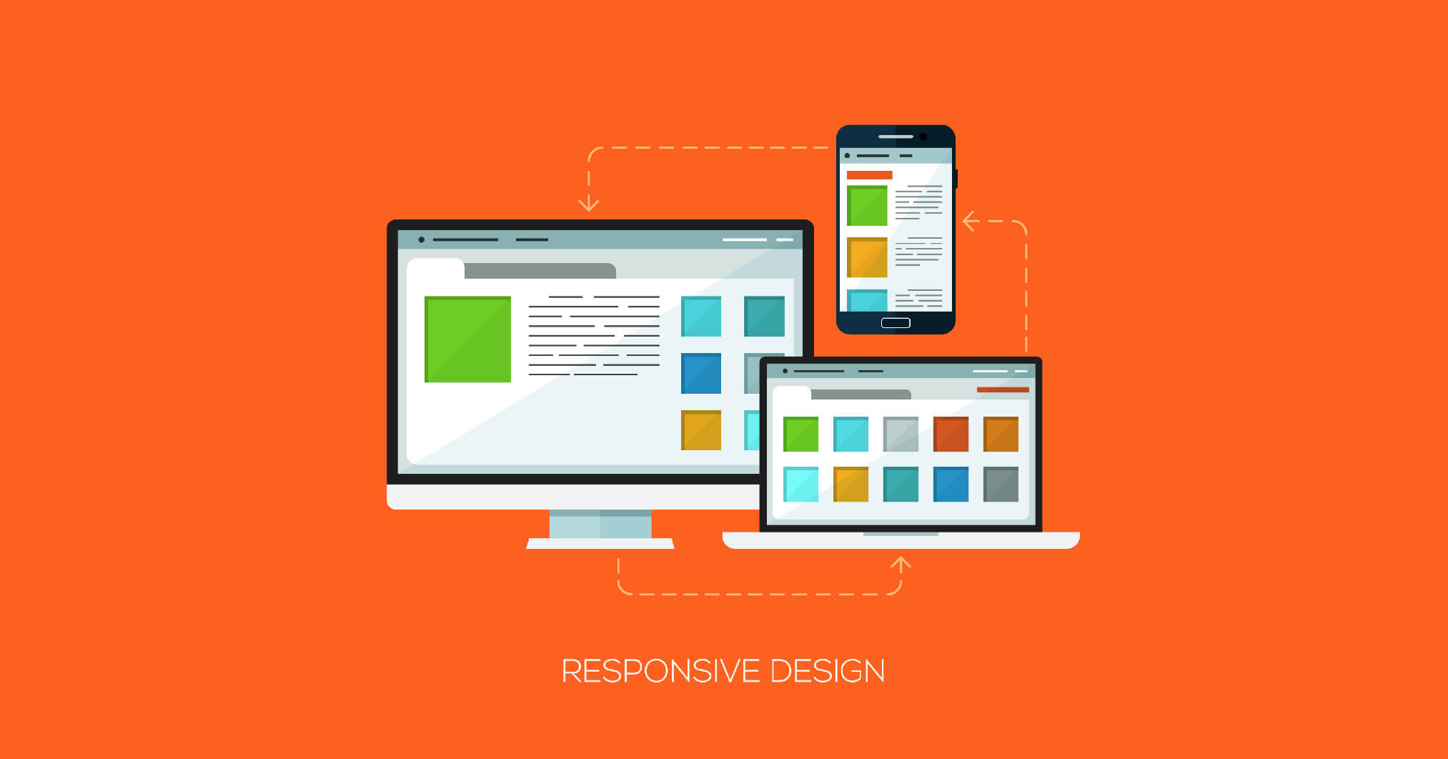
Incorporate responsive design
A responsive website is crucial with the increasing use of mobile devices. The use of responsive design ensures that your website will display properly on a variety of screen sizes and devices. This means that whether someone is browsing on a desktop computer or a smartphone, they will have a seamless experience.
When incorporating responsive design into your website, there are a few key principles to keep in mind. Prioritize user experience by making sure that the layout and content adjust dynamically based on the device being used. This includes optimizing images and text for different screen resolutions.
Pay attention to navigation elements. Consider using collapsible menus or hamburger icons to save space on smaller screens while still allowing users to easily access all areas of your site.
Test your website across different devices and browsers regularly to ensure everything functions as intended. By constantly monitoring and tweaking your responsive design, you can provide an optimal browsing experience for all visitors.
Remember, having a responsive website not only improves usability but also contributes positively towards search engine rankings. So make sure you incorporate this important design principle into your web development process!
Optimize your website for search engine ranking
When it comes to creating a website, one of the most important aspects is ensuring that it ranks well in search engine results. Then again, what good is a beautifully designed website if no one can find it? Optimizing your website for search engine ranking is crucial in order to increase visibility and drive organic traffic to your site.
Start by conducting keyword research to identify relevant keywords and phrases that are commonly used by your target audience when searching for information related to your industry or niche. Incorporate these keywords strategically throughout your website’s content, including headings, titles, meta descriptions, and image alt tags.
In addition to keyword optimization, make sure that the technical aspects of your website are up-to-date and optimized. This includes optimizing page load speed, using clean code structure, implementing schema markup for better understanding by search engines, and ensuring mobile-friendliness.
Another important aspect of SEO optimization is building high-quality backlinks from reputable websites within your industry. These backlinks not only help improve search engine rankings but also establish credibility and authority for your own website.
Regularly monitoring and analyzing key metrics such as organic traffic, bounce rate, conversion rate,and keyword rankings will allow you to continually optimize and refine your SEO strategy over time.
By optimizing your website for search engine ranking with proper keyword usage, content organization, and technical improvements, you can significantly increase its visibility on the web, resulting in more potential customers finding their way to you!
Use high-quality, original imagery
When it comes to creating a visually appealing website, high-quality and original imagery plays a crucial role. In today’s digital world, where attention spans are short and competition is fierce, captivating visuals can make all the difference in capturing your audience’s attention.
Using stock photos may seem convenient, but they lack uniqueness and fail to add personality to your brand. Investing in professional photography or creating custom illustrations will not only set you apart from competitors but also help establish credibility with your target audience.
Original imagery allows you to showcase your products or services in an authentic way that resonates with potential customers. It helps convey your brand message effectively and creates a memorable experience for visitors. The right images can evoke emotions, inspire action, and strengthen the overall user experience.
In addition to being visually appealing, high-quality imagery ensures that your website looks professional across different devices and screen sizes. Blurry or pixelated images can leave a negative impression on users and signal a lack of attention to detail.
Remember that good design includes more than just aesthetics; it should also be functional. Optimize your images by compressing them without compromising quality so that they load quickly without slowing down the performance of your website.
By using high-quality, original imagery throughout your website, you can create a visually stunning online presence that engages visitors and leaves a lasting impression on their minds. So take the time to invest in professional photography or create unique illustrations because when it comes to web design – image matters!
Ensure a consistent user experience across all devices
In today’s digital age, it is crucial for businesses to provide a consistent user experience across all devices. Whether your customers are browsing on their desktop, tablet, or smartphone, they should be able to easily navigate and interact with your website.
Responsive design is one way to accomplish this. This means that your website will automatically adjust its layout and content based on the size of the screen it is being viewed on. By doing so, you ensure that all users have access to the same information and functionality, regardless of the device they are using.
Another important aspect of creating a consistent user experience is ensuring that your website loads quickly on all devices. High bounce rates can be caused by slow loading times. Optimizing images and minimizing code can help improve load times and enhance the overall user experience.
Additionally, consider how users interact with different devices. For example, mobile users may prefer larger buttons or swipe gestures for navigation purposes. By tailoring these elements to each device type, you can make it easier for users to engage with your site.
Use calls to action to guide users
In today’s digital landscape, having a customer-friendly website is crucial for the success of your business. By following these 10 web design principles, you can create a user-centric website that not only attracts your target audience but also keeps them engaged and converts them into loyal customers.
One final principle to consider is the use of calls to action (CTAs) to guide users throughout their journey on your website. CTAs are strategically placed buttons or links that prompt users to take specific actions, such as “Learn More,” “Sign Up Now,” or “Buy Now.” These CTAs serve as signposts, directing visitors towards desired conversions.
When designing your CTAs, make sure they stand out visually from the rest of the page by using contrasting colors and compelling copy. The placement of CTAs should be intuitive and easy for users to find without being overly intrusive. Consider incorporating them at strategic points in your content, such as after introducing key features or benefits.
Effective CTAs can significantly increase user engagement and drive conversions on your website. They provide clear directions for visitors on what steps they need to take next and encourage them to take action rather than passively browsing through your site.
By implementing these 10 web design principles – including targeting your audience, utilizing typography hierarchy, limited color palettes, whitespace utilization, responsive design optimization; high-quality imagery selection; consistency across devices; SEO ranking optimization; and effective use of calls-to-action – you’ll be well-equipped to create an engaging online presence that delights users while driving business growth.
Remember that web design in kolkata is an ongoing process. Continuously monitor visitor behavior data analytics tools like Google Analytics helps identify areas where improvements can be made so you can continuously refine and optimize your website for optimal performance.