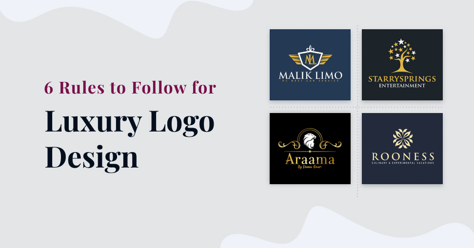
The 6 Rules to Follow for Luxury Logo Design
- Home
- The 6 Rules to Follow for Luxury Logo Design

In today’s world, a luxury logo is more than just a simple emblem. It has become a symbol of the brand’s identity and reputation. A well-designed logo can make or break your business, especially in the competitive market of Kolkata. As the demand for quality logos increases, so does the need for expert logo designers who understand the importance of minimalism, negative space, appropriate typography, and versatility. In this blog post, we will discuss six essential rules that every luxury logo design company in Kolkata must follow to create stunning and timeless logos that truly stand out from the crowd!
Make it Minimalist
When it comes to luxury logo design, less is often more. A minimalist approach can create a clean and elegant design that truly stands out from the rest. The key to making a minimalist logo work is by focusing on the essential elements of your brand and stripping away anything unnecessary.
A simple yet striking symbol or emblem can be much more memorable than an overly complex design with too many details. By keeping your logo minimalistic, you allow your audience to focus on what really matters – your brand’s identity.
Minimalism doesn’t mean sacrificing creativity or style either. In fact, some of the most iconic logos in history are incredibly simple in their designs. Take Nike’s swoosh or Apple’s bitten apple for example – both are instantly recognizable and have become synonymous with their respective brands.
By embracing simplicity in your luxury logo design, you can create a timeless and powerful visual identity that will stand the test of time.
Use Negative Space
Using negative space in your luxury logo design can be an effective way to create a memorable and unique brand image. Negative space refers to the areas surrounding or between the main elements of your logo, which can be used creatively to convey additional messages about your brand.
One of the most famous examples of using negative space is the FedEx logo. The hidden arrow created by the white space between E and x has become a well-known symbol for speedy delivery services.
Negative space also creates balance and harmony in your design, making it more visually appealing. It allows you to simplify complex ideas into one simple icon that is easy for people to recognize and remember.
However, using negative space effectively requires careful planning. You need to strike a balance between making sure it’s noticeable enough and not overpowering other elements in your logo design.
Incorporating negative space may seem like a small detail but when executed correctly, it can make all the difference in branding success. So don’t hesitate to use this powerful tool when designing your luxury logo!

Stick to One or Two Colors
When it comes to luxury logo design, sticking to one or two colors can make a big impact. This rule may seem limiting, but it actually allows for more creativity and cohesion in the overall design.
Using too many colors can be overwhelming and take away from the simplicity and elegance of a luxury brand. By using just one or two colors, designers are forced to create contrast and depth through different shades and tones of those chosen hues.
Additionally, having fewer colors makes the logo easier to remember and recognize. Think about some of the most iconic luxury brands like Chanel, Louis Vuitton, or Hermès – all have simple yet memorable logos with only one or two main colors.
Of course, choosing the right color(s) is crucial in this process. It’s important that they not only represent the brand’s values and aesthetics but also resonate with their target audience.
Keeping your color palette limited when designing a luxury logo allows for more creativity within constraints while creating a memorable visual identity that represents your brand’s values effectively.
Appropriate Typography
Appropriate typography is an essential rule in luxury logo design. Typography can convey the brand’s personality and help it stand out from competitors. When choosing a font, it’s important to consider legibility, readability, and scalability.
Legibility refers to how easy it is to read the font at different sizes and distances. A good luxury logo should be easily identifiable even when viewed from afar or in small sizes.
Readability refers to how easy it is for someone to understand what the text says. Using a font that matches your brand identity will make your message more clear.
Scalability refers to how well the font maintains its clarity when resized up or down. The chosen font should work well on all types of promotional materials such as business cards, billboards, web banners, etc.
It’s also important not to use too many fonts in one design; stick with one or two maximum so they don’t clash with each other. Select a typeface that appropriately represents your company’s values and objectives while maintaining elegance and sophistication – this will ensure that you have truly created a luxurious logo design!

Make it Timeless
When it comes to luxury logo design, the timeless appeal is crucial. A logo that stands the test of time will ensure your brand remains recognizable and relevant for years to come.
To create a timeless logo, it’s important to avoid trendy design elements that may fall out of fashion quickly. Instead, focus on classic and simple designs that evoke a sense of tradition and elegance.
Another key aspect of creating a timeless logo is versatility. Your logo should work across different mediums and platforms without losing its impact or effectiveness.
Consider using traditional typography rather than flashy fonts or graphics that may not age well over time. Choosing neutral colors can also help your logo remain relevant for decades to come.
Designing a timeless luxury logo requires careful consideration and attention to detail. By prioritizing simplicity, tradition, versatility, and longevity in your design choices you can create an enduring symbol of your brand’s identity that will stand the test of time.
Make it Versatile
When it comes to luxury logo design, versatility is key. Your logo should be able to adapt and look great in any size or format. Whether it’s on a website header or a business card, your logo needs to remain clear and legible.
To achieve this level of versatility, consider creating variations of your logo for different applications. For example, you might have a simplified version for smaller sizes or an alternate color scheme for black and white printing.
By following these six rules for luxury logo design – making it minimalist, using negative space, sticking to one or two colors, choosing appropriate typography, and making it timeless and versatile – you’ll create a branding asset that reflects the quality and sophistication of your business.
Remember that every element of your brand communicates something about who you are as a company. A well-crafted logo can make all the difference in setting yourself apart from competitors in Kolkata’s crowded marketplace.
So take the time to craft something truly exceptional with help from an experienced logo design company in Kolkata like ours!
Recent Posts
- How to Optimize Your Google My Business Listing for Local SEO Success
- Content is King: Crafting Shareable Content in the Digital Age
- Essential Strategies for E-commerce Success
- Secrets of Instagram Success: Mastering Stories, Hashtags, and Engagement
- Stand Out Locally: Supercharge Your Business with Local SEO
- The Power of E-A-T: How Google’s Algorithm Emphasizes Expertise, Authoritativeness, and Trustworthiness
- Sweet Treats, Sweet Designs: How to Make Your Sweets Boxes Stand Out
- 10 Signs of a Top-Notch Logo Design Company to Look For
- How To Design A Creative Logo For Your Business: The Ultimate Guide 2024
- Video Impact: Elevating Brand Stories, Amplifying Audience Engagement