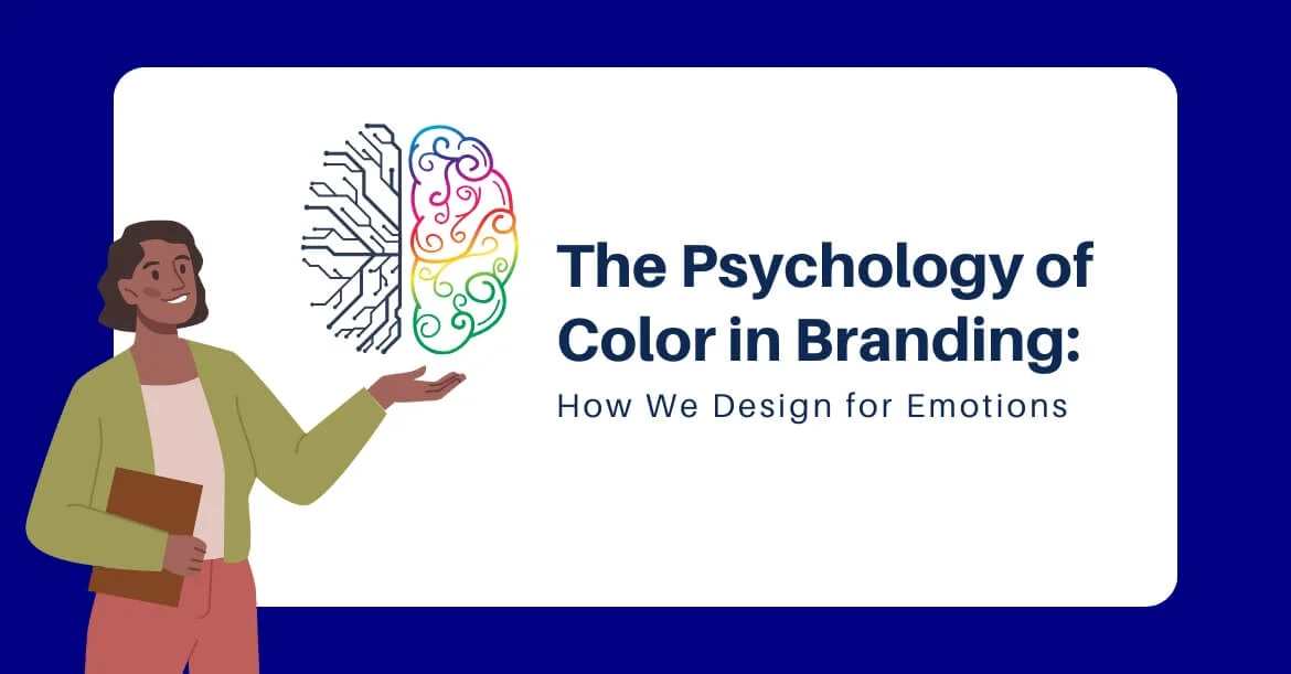
Colors are far more than mere visual elements. They carry psychological weight, subtly influencing perception, behavior, and decision-making. In the realm of branding, understanding color psychology is a crucial component for companies aiming to connect with their audience on an emotional level. Colors act as the silent ambassadors of a brand, communicating values, emotions, and intentions before a single word is read or heard.
Branding is not just about logos or aesthetics; it is a carefully orchestrated strategy designed to elicit specific emotional responses. Every hue, shade, and tone can affect consumer perceptions, shaping how a brand is recognized, remembered, and trusted. This connection between color and emotion has been extensively studied, revealing patterns in human behavior that businesses leverage to create powerful brand identities
Emotional Influence of Colors in Branding
Each color evokes distinct emotions, which marketers and designers use to craft compelling brand narratives. Red, for instance, is known for its intensity and energy, often associated with passion, urgency, or excitement. It can stimulate appetite and attention, making it a popular choice in the food and retail industries. Blue, in contrast, conveys calm, trust, and stability. Brands in technology, finance, and healthcare frequently employ blue to establish credibility and professionalism.
Yellow evokes warmth, optimism, and cheerfulness, yet its overuse can lead to feelings of anxiety. Green connects to nature, growth, and sustainability, ideal for brands promoting eco-friendliness or health-related products. Black communicates sophistication, luxury, and authority, while white signifies purity, simplicity, and clarity. Understanding these associations allows designers to strategically align color choices with a brand’s core message.
Cultural and Contextual Considerations
Color perception is not universal; it is influenced by cultural norms, social context, and personal experiences. While white symbolizes purity in Western cultures, it is traditionally associated with mourning in some Eastern societies. Similarly, red represents luck and prosperity in Chinese culture, contrasting with its association with danger or warning in Western contexts.
Global brands must navigate these differences carefully, ensuring their color palette resonates positively across target markets. Logo designing company in Kolkata, for example, often incorporates local cultural insights into their design process, blending aesthetics with emotional resonance tailored to regional audiences. Contextual relevance ensures that color choices strengthen brand messaging rather than unintentionally conveying negative connotations.
The Science Behind Color Perception
The psychological impact of color extends beyond symbolic associations. Neuroscience research reveals that colors influence human cognition and physiology. Bright and saturated colors can increase alertness and energy levels, while muted tones promote relaxation and contemplation. Color affects eye movement, attention span, and memory retention, making it an essential tool for effective marketing.
Marketers often use these insights to guide consumer behavior. For instance, fast-food chains frequently incorporate red and yellow in their branding to stimulate appetite and prompt quick decision-making. Financial institutions, however, lean on blue and grey to instill confidence and reliability. This scientific approach to color selection transforms design into a calculated mechanism for emotional engagement.

Color Harmony and Brand Consistency
The emotional impact of color is amplified when applied consistently across all brand touchpoints. Logo, website, packaging, social media, and advertising must maintain a cohesive color strategy to reinforce recognition and trust. Color harmony ensures that each element supports the brand’s identity, creating a seamless visual experience for consumers.
Designers often rely on color theory to achieve balance, employing complementary, analogous, or triadic schemes to maintain aesthetic appeal. Proper contrast enhances readability and accessibility, ensuring the brand communicates clearly without causing visual fatigue. Consistency in color use solidifies brand recall, making it easier for consumers to connect emotionally with the brand over time.
Strategic Application in Brand Storytelling
Beyond aesthetics, color functions as a narrative device in branding. Brands use color to convey their values, mission, and personality. A startup focused on sustainability might emphasize greens and earthy tones to reinforce its commitment to the environment. A luxury brand may choose deep blacks and metallic accents to project exclusivity and elegance.
In practical terms, the selection of colors is a deliberate process. Designers consider the target audience, industry trends, competitive landscape, and desired emotional response. Each decision is grounded in research and analysis, ensuring that the brand identity resonates with consumers while maintaining differentiation in the market.

Measuring Color Impact and Adaptation
While intuition plays a role, successful brands rely on data-driven insights to optimize color strategy. A/B testing, focus groups, and consumer feedback provide measurable evidence of how colors influence engagement, recall, and conversion. These insights enable brands to adapt over time, refining their palette to align with evolving market preferences and emotional cues.
Dynamic brands recognize that color is not static; it interacts with trends, technology, and cultural shifts. By staying attentive to these changes, brands ensure that their emotional resonance remains strong and relevant.
Conclusion
Color in branding is far more than a decorative choice; it is a psychological tool that shapes perception and guides emotional responses. From cultural considerations to neuroscience insights, every color decision impacts how a brand is experienced and remembered. Through strategic application and consistent implementation, brands can build identities that resonate deeply with consumers, fostering trust, loyalty, and recognition.
A thoughtful color strategy, informed by science and cultural awareness, transforms visual elements into powerful emotional touchpoints. By understanding the psychology of color, businesses can create brand experiences that are not only visually appealing but emotionally compelling, leaving a lasting impression in a crowded marketplace.