Web design is regarded as a craft in the digital economy. According to the digital marketing company, the designer strives to present some effective photos and writings to the visitors using the web development. Almost everyone nowadays relies on websites for everything, not just large things, but also minor things, resulting in the dominance of the web design industry.
As a member of the web design industry, we, at Next Screen Infotech, have seen merchants and website owners increasingly paying attention to a new idea known as Responsive Web Design. So, how about we see what this new notion is all about?

What Exactly is the New Idea?
Responsive web design is a new strategy in which a designer creates an optimized website to transmit more information to the visitor. This innovative model offers greater flexibility than traditional websites, which are designed to be more rigid. The static design will soon be a thing of the past in the digital industry, as the new concept of responsive web design is rapidly gaining popularity, owing to its user-friendly approach. The designers turn a traditional static website into a responsive one by making it dynamic, which allows for improved visitor engagement.
The following are some of the most recent responsive web design best practices:
- The first step is to switch from static to dynamic and responsive prototypes.
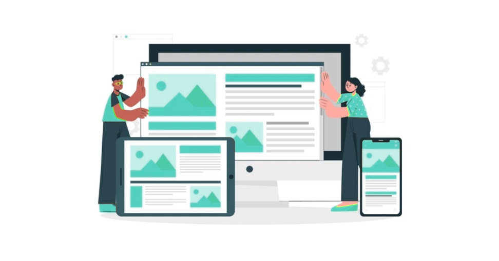
- Designing a website such that it can be seen on any platform, from computers to cellphones.
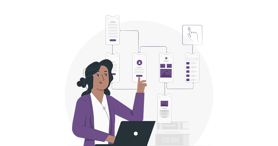
- Using low-fidelity prototype designs during the design process.
If you’re thinking about taking the initial move, you need first prepare your material. With the content in hand, the designers may select which aspects of the website are the most important, which leads to a precise hierarchical structure. Although we recognize that the complete material cannot be provided at all times, you may experiment with a simplified arrangement to get a quick sense.
Following the content preparation, the following step should be to examine your Mobile-First strategy. This step ensures that your website design is compatible with every device on which it will be stored. In addition, the photographs are scaled to match the screen resolution. Furthermore, you will receive a design that allows you to engage with visitors on both computers and smartphones.
The Reason for Responsive Web Design
As previously said, responsive web design is more engaging than static web design and can be seen on any device. Its dynamic animations, hovering components, slideshows photos, navigation, and motions totally change the surroundings while also attracting users’ attention. Visitors gain more information about what the website is about and what it offers because of its over design. It adds to the pleasure of the website and keeps visitors interested for longer. And, as you may know from the equation, more traffic equals more profit. As a result, we at Next Screen Infotech, a responsive web design service company, can confidently state that responsive web design outperforms static compositions in every way.